Year In Review: 2022

Lights Going Out

Obviously, we didn’t meet our goal of completing the game this year.
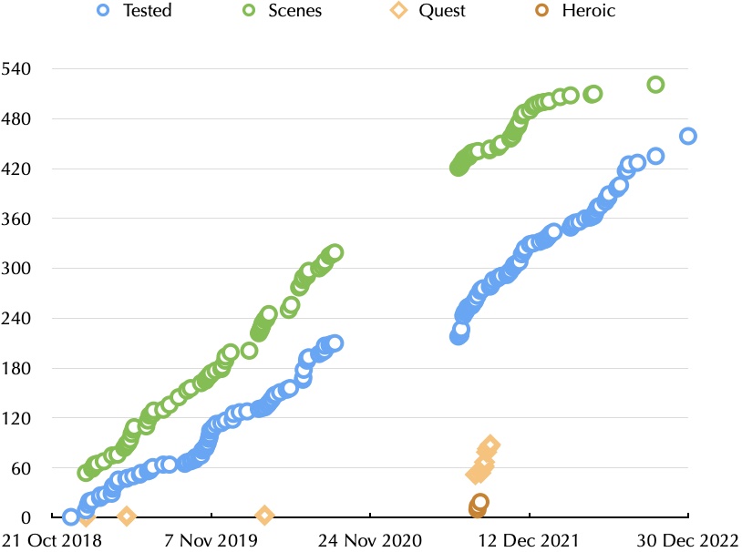
Chart showing scenes coded and scenes fully tested

We are a lot closer. The “exhaustive scene testing” chart isn’t a complete picture, but it’s one way to visualize the progress. For what it’s worth, there are about 36% more scenes than “Ride Like the Wind” (which is one reason it’s taking so long to wrap up).
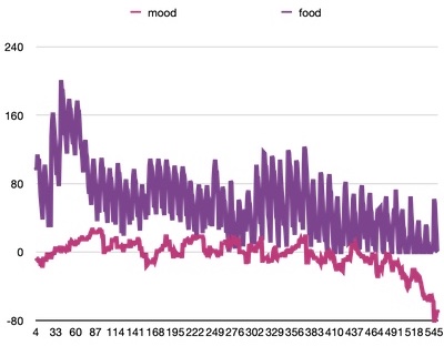
Chart of mood and food

We’ve also been testing the balance of different victory benefits for games continued from the first chapter, and tracking emergent behavior from different play styles. Is it possible to win without anyone starving? Does clan mood go into an irrevocable dive? Can you quash the local impact of Chaos? Can you still win at Harsh difficulty? The game tracks a number of values, and I graph these so I can spot unusual changes. If there’s a big change, I can check the logs to see what caused it.

A less tangible factor is how the game feels. Testing isn’t really the same as playing, but I think we’ve identified a few places where we needed to create more stories. (That’s the rightmost green circle in the chart.)
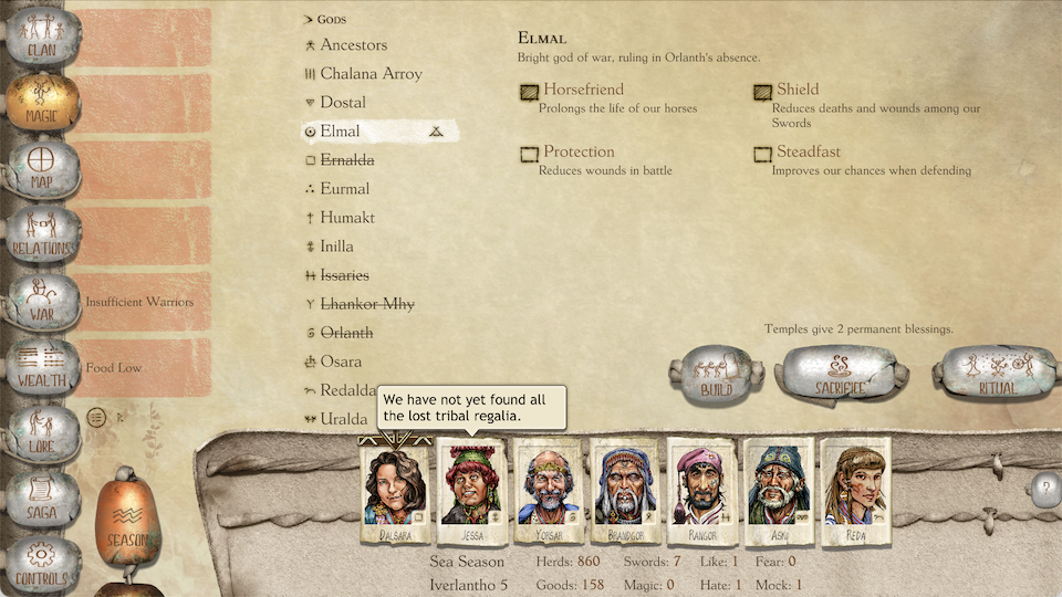
Magic screen from the Mac build

The first game was set in the Storm Age. This one takes place in the Chaos Age (or Great Darkness). Our plan was always to adjust the user interface to reflect the difference. Our publisher’s art director, Xin Ran Liu, gave us new assets that reflect your clan’s rise to glory (buttons are now metal) and the decay of the period (buttons are cracked or suffer from tin pest).

The music also needs to reflect the differences, as well as different story themes. We’ve made some good progress.

Our development process is dependent on iOS (for build automation, bug reporting, and unit testing), but late this year we made sure that the game still builds for Windows and macOS, and has the necessary UI changes. I often seemed to be fighting the development tools (breakpoints have been my nemesis with Unity since 2012) and various compatibility issues. But on the plus side, my tools do seem to be working better with Windows. The desktop builds are basically ready to start testing.
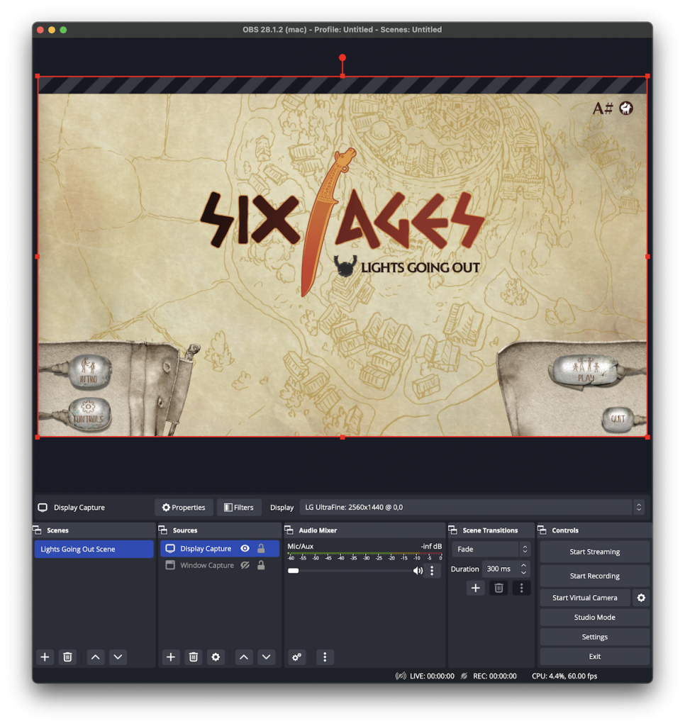
OBS capturing the Six Ages main menu

Since we have the game running at 16:9 with a cursor, we can make a game play trailer, which we need to create a Steam page. (I expect Kitfox Games will be setting that up next month.) I’m sure I’m only scratching the surface of what OBS can do, but it does let me capture video of just the content area of the game window.

There’s still artwork, music, and testing to complete, but things look much closer than they did a year ago.

Ride Like the Wind
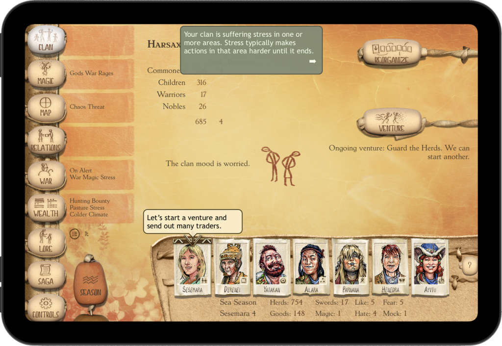
Clan screen on iPad mini (6th generation)

Our focus was on finishing “Lights Going Out,” but since the code base is the same, we released an update to the App Store to deal with the latest iPad mini. Unlike desktop, which has fewer screen shapes and typically letterboxes, the iPad and iPhone builds use every available pixel. The original design was back when all iPads were at least 768 points high, and things like the side menu needed a little tweaking for the 744 point mini.

World Events

COVID continues to be an issue. Our summer intern caught it and wasn’t able to do as much testing as we’d hoped. Please wear an N-95 mask when you’re out in public!

Russia’s attack on Ukraine hasn’t had a direct impact on our team, and so far HeroCraft (which is based in Russia) has been able to keep publishing King of Dragon Pass for us.

Thanks to Elon Musk’s mismanagement of Twitter, we’re now also posting on Mastodon at mastodon.gamedev.place/@asharp.

What Next?

The Six Ages games have taken a lot longer than I expected to create. In 2023, I may be able to start something shorter.
Advice

One of the features that makes Six Ages (and King of Dragon Pass before it) unique is how it handles advice. Certainly games have had advisors before (such as Hidden Agenda or Civilization II), but in Six Ages your advisors are actual playing pieces, as well as part of the user interface. They are player agents and contribute to immersion, but their primary role is to provide information.

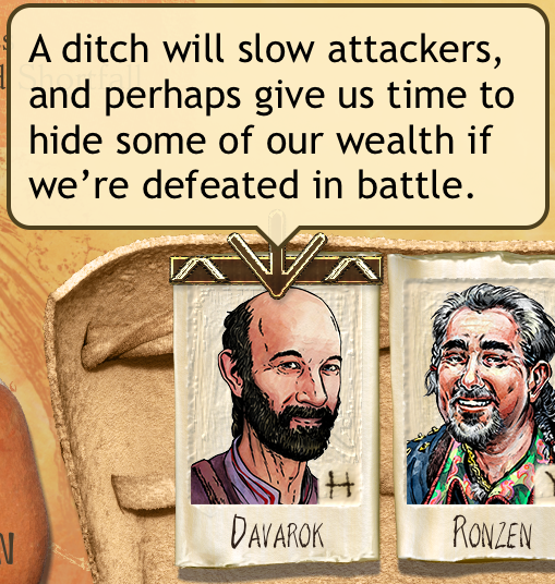
Advice about building a ditch

Advice is given by notable leaders you pick to sit on the clan council. As characters who live in Glorantha, they know how the world works, the customs of your culture, and what has gone on before (both the pre-game history and game events). We don’t expect you to know all the lore, because an advisor can give you a summary. They’re keenly aware of the agricultural calendar and stored food. And they can suggest actions that would be obvious to someone living in your clan.

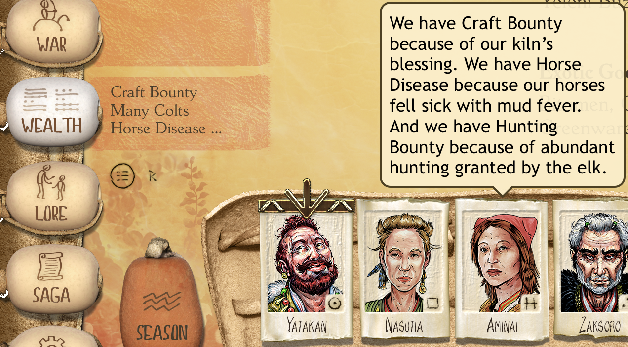
Explanation of Wealth concerns

We leverage this to supplement the user interface. The dashboard (next to the menu buttons) gives a very brief summary of various concerns, and advisors can give a more detailed explanation. Advice on the Magic screen summarizes your temple maintenance costs. Advice for the Raid dialog will remind you about clans you’ve promised to raid. Wealth screen advice estimates your market profit and craft production.

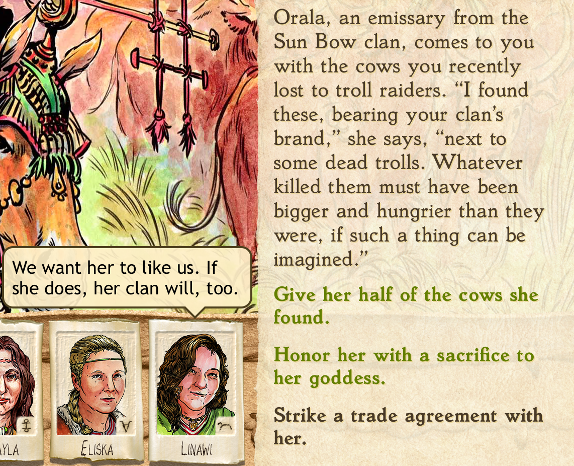
Advice with two recommendations

In story events, advice is often associated with recommendations. An advisor may summarize the situation or try to predict the consequences of different actions, and also suggest one or more responses. Other times, they may just let you know what the tradeoffs might be, but not suggest how to resolve them.

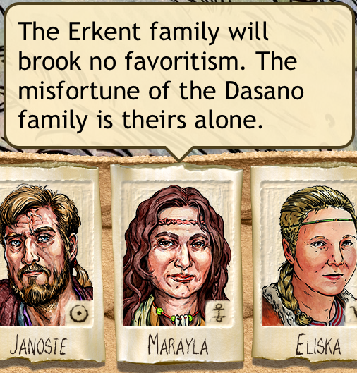
Erkent family has little sympathy for the Dasano family

Although their job is to advise you (and carry out your decisions), your council is composed of people with personalities, which may flavor their advice. This doesn’t mean their advice is incorrect, but an advisor may tend to see only one side of certain issues. It can also provide a hint as to how well they can execute an action — a kindly character may not be ideal to try intimidating another clan, though they’ll give it their best shot if necessary.

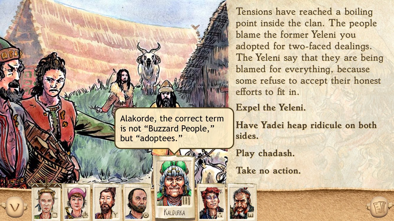
Calling out Alakorde for a slur

Sometimes those personalities clash, and you’ll see advisors talking to each other. Here’s the code for one such exchange:

[Relandar Priority] The Buzzard People should try harder to fit in. [4]
[Erissa Priority AND RelandarOnRing] <r>, the correct term is not “Buzzard People,” but “adoptees.” [5]

Characters sometimes have other human relationships to each other, particularly since the Six Ages games are multi-generational.

Getting all this to work well can be a tricky balance. In a scene, we try to make sure that you get the information you need to weigh the responses. This usually relates to the skills of your advisors. Balancing the Seven Families usually comes down to Leadership, so we try to make sure you get the best possible Leadership advice. Gauging relative military strength is the Combat skill, but if nobody on the circle has a high enough Combat ability, you won’t be shown that insight. Sometimes an event relates to a specific leader, or the god they worship, in which case we mark that advice as being higher priority. Most advice is context-sensitive (e.g. you’ll be reminded if your herds are getting low), and sometimes these sorts of conditions are also considered as priority advice. A character might give different advice depending on whether or not they’re the clan chief, or what family they belong to. On the other hand, there’s no need for two people to remind you that clan magic is depleted.

It’s also tricky in that what advice you get not only depends on the situation, but who you have on the circle. If none of them worship Elmal, you won’t get any Elmal-specific advice. If two of them happen to hate the Wheels, you might get that twice. Sometimes someone else has already given the useful skill advice, and an advisor’s traits don’t match any personality advice. There are actually two levels of fallback advice to help make sure everyone has something interesting to say. Since situations when advisors will comment to each other are rare (the circle needs two or even three characters with a particular personality or religion), we try to give these priority.

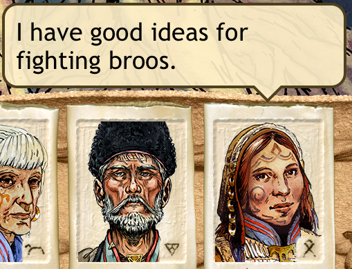
“I have good ideas for fighting broos”

It’s worth noting that each chapter has somewhat different aspects to determine advice. Several generations after the events of “Ride Like the Wind,” it might not make as much sense to be concerned about your ancestral home, and more sense to worry about new threats. And the political situation within the clan is different.

Right now a major QA focus as we develop “Lights Going Out” is to scrutinize the advice and make sure it makes sense. If a recommendation doesn’t match what a character suggests, it might seem like a minor bug, but it actually undermines the entire idea of useful advice. Your advisors don’t know everything and they may be biased, but they aren’t stupid. There are also opportunities for advice specific to characters that might not have existed when a scene was originally written.

To summarize, I advise that you read the advice.

PC User Interface

We spent a lot of effort making sure that the mobile version of the game worked well on all screens, from the smallest iPhone to the largest iPad, and from the low-resolution (132 pixels/inch) iPad 2 to the super-crisp (458 pixels/inch) iPhone 11. So we wanted to make sure that the personal computer version worked equally well with a mouse, keyboard, and PC screens.

Layout

iPad and iPhone shapes

iPhones and iPads come in a pretty large variety of screen sizes. Many iPhones have a 16:9 aspect ratio and many iPads are 4:3, but you need to adapt to different shapes. For mobile, we had two main rules: always use the entire screen, and since the pixel size is constant, show more content on larger screens (i.e. cover less of the text and require less scrolling). A secondary rule was to show all artwork — it’s never cropped.

As most games treat them, PC screens are actually pretty limited in sizes. The actual pixel resolution doesn’t matter so much as the aspect ratio. Most screens are 16:9, some 16:10, and some 4:3. Other aspect ratios are rare.

All PC screens are large enough that we can show the menu and dashboard on the left at all times, like our iPad layout. And stretching management screens from the nominal 4:3 design to 16:9 generally worked well. That covers most of the three dozen screens, including dialogs like Emissary and Sacrifice.

4:3 iPad

Things got more interesting when there are illustrations (like interactive scenes). Pat Ward’s design assumed a 4:3 screen (those were the only iPads when we began the game), but I was able to add some blank space in a few places to deal with things like the 12.9 inch iPad Pro, where picture plus advisors no longer filled the screen.

16:9 PC

But significantly wider screens makes a difference. With a 4:3 aspect ratio, the text parchment covers part of the illustration. With a 16:9 screen, text can be on the side, leaving all the art exposed.

On a 16:10 screen, the text would end up too narrow if it were restricted to the side, so it will cover artwork.

Unfortunately, we ran into some layout issues with 5:4 screens. These are rare, so we violate the “fill the screen” rule and letterbox. (This is pretty common for games.)

Unlike iPad, where the larger iPad Pro lets us show more information, larger PC screens are just larger. Since text is larger, it can use more pixels, and look crisper. Other than that, the game looks the same on my 5120 * 2880 display or QA’s 1366 * 768 laptop.

Controls

Six Ages uses three custom controls: value sliders, filters to choose what’s shown (e.g. feuding or allied clans), and a similar picker to sort leaders.

Sliders don’t need a large target to adjust the value, since a mouse is much more precise, and you can click on the bar to increment or decrement.

In a standard desktop app, you’d probably use a popup menu to filter a list. Mobile UIs don’t usually use popups, which is why we had a horizontal picker. But for the PC, we went back to the default. The precision of the mouse means that this can be more compact.

We probably could have used a popup to sort leaders, but I wanted to emphasize that one control would show you different information, and the other the same information in a different order. So we kept the horizontal list.

Mouse

Rejected Knife Cursor

Most games use custom cursors, to fit the game theme. I really liked the idea of using the curved knife from the game logo, since once you flipped it, it was at the same angle as a standard arrow cursor. But nobody liked how it worked in practice. One playtester called it a “feather.” It was also unclear how large to make it. We eventually settled on a more traditional arrow, but in the colors of the knife.

Arrow Cursor

Many UI elements need a rollover state, to indicate that they will do something when clicked (and aren’t a decorative element). We didn’t need this for the mobile UI, so it was something we had to add to our buttons. (Thanks to Xin Ran Liu for working with me on this!)

Rollover is also a great way to show transient information — like a tool tip. We had a few places where you tapped to get extra information, so these were easy candidates for rollover. (Note that you want to see advice while interacting elsewhere on the screen; you click to show it, rather than have it disappear as you point to a response.)

The game has lots of scrollable lists and text, so the mouse’s scroll wheel usually scrolls. We broke this convention to support another common game convention: using the scroll wheel on the map zooms in or out.

Keyboard

Although the game can be played entirely with the mouse, it’s convenient to have a keyboard shortcut for common operations like dismissing news or picking a response. To make this work, responses are numbered.

And you can reveal an illustration behind text with the space bar.

I had wanted to let the player show advice via the keyboard, but decided not to delay the game to implement this.

Sacred Time Recap

Several King of Dragon Pass players requested a way to see what their Sacred Time allocations of clan magic were. In most cases, advisors will remind you on the relevant screen (especially in version 2, which added a lot of advice to the management screens). For example, in the Magic screen, if you put points into Quest magic, someone will have the advice “We prepared for a quest during Sacred Time. Our chance of success is good” (assuming it’s not trumped by some other circumstances).

Magic ScreenWhen I began Six Ages, I wanted to have a centralized place to see everything. Until recently, it didn’t seem like it would fit. Then Robin Laws suggested showing some other information, and I realized that the Sacred Time allocations could be added as well. (The slider lets you choose to see the gods, or the new other information.)