We spent a lot of effort making sure that the mobile version of the game worked well on all screens, from the smallest iPhone to the largest iPad, and from the low-resolution (132 pixels/inch) iPad 2 to the super-crisp (458 pixels/inch) iPhone 11. So we wanted to make sure that the personal computer version worked equally well with a mouse, keyboard, and PC screens.
Layout
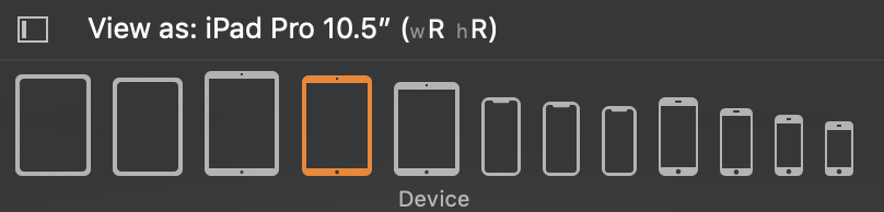
iPhones and iPads come in a pretty large variety of screen sizes. Many iPhones have a 16:9 aspect ratio and many iPads are 4:3, but you need to adapt to different shapes. For mobile, we had two main rules: always use the entire screen, and since the pixel size is constant, show more content on larger screens (i.e. cover less of the text and require less scrolling). A secondary rule was to show all artwork — it’s never cropped.
As most games treat them, PC screens are actually pretty limited in sizes. The actual pixel resolution doesn’t matter so much as the aspect ratio. Most screens are 16:9, some 16:10, and some 4:3. Other aspect ratios are rare.
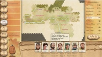
All PC screens are large enough that we can show the menu and dashboard on the left at all times, like our iPad layout. And stretching management screens from the nominal 4:3 design to 16:9 generally worked well. That covers most of the three dozen screens, including dialogs like Emissary and Sacrifice.
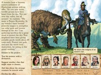
Things got more interesting when there are illustrations (like interactive scenes). Pat Ward’s design assumed a 4:3 screen (those were the only iPads when we began the game), but I was able to add some blank space in a few places to deal with things like the 12.9 inch iPad Pro, where picture plus advisors no longer filled the screen.
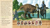
But significantly wider screens makes a difference. With a 4:3 aspect ratio, the text parchment covers part of the illustration. With a 16:9 screen, text can be on the side, leaving all the art exposed.
On a 16:10 screen, the text would end up too narrow if it were restricted to the side, so it will cover artwork.
Unfortunately, we ran into some layout issues with 5:4 screens. These are rare, so we violate the “fill the screen” rule and letterbox. (This is pretty common for games.)
Unlike iPad, where the larger iPad Pro lets us show more information, larger PC screens are just larger. Since text is larger, it can use more pixels, and look crisper. Other than that, the game looks the same on my 5120 * 2880 display or QA’s 1366 * 768 laptop.
Controls
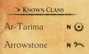
Six Ages uses three custom controls: value sliders, filters to choose what’s shown (e.g. feuding or allied clans), and a similar picker to sort leaders.
Sliders don’t need a large target to adjust the value, since a mouse is much more precise, and you can click on the bar to increment or decrement.
In a standard desktop app, you’d probably use a popup menu to filter a list. Mobile UIs don’t usually use popups, which is why we had a horizontal picker. But for the PC, we went back to the default. The precision of the mouse means that this can be more compact.
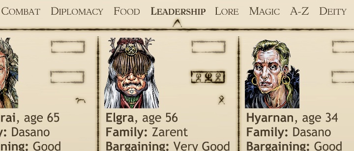
We probably could have used a popup to sort leaders, but I wanted to emphasize that one control would show you different information, and the other the same information in a different order. So we kept the horizontal list.
Mouse
Most games use custom cursors, to fit the game theme. I really liked the idea of using the curved knife from the game logo, since once you flipped it, it was at the same angle as a standard arrow cursor. But nobody liked how it worked in practice. One playtester called it a “feather.” It was also unclear how large to make it. We eventually settled on a more traditional arrow, but in the colors of the knife.
Many UI elements need a rollover state, to indicate that they will do something when clicked (and aren’t a decorative element). We didn’t need this for the mobile UI, so it was something we had to add to our buttons. (Thanks to Xin Ran Liu for working with me on this!)
Rollover is also a great way to show transient information — like a tool tip. We had a few places where you tapped to get extra information, so these were easy candidates for rollover. (Note that you want to see advice while interacting elsewhere on the screen; you click to show it, rather than have it disappear as you point to a response.)
The game has lots of scrollable lists and text, so the mouse’s scroll wheel usually scrolls. We broke this convention to support another common game convention: using the scroll wheel on the map zooms in or out.
Keyboard
Although the game can be played entirely with the mouse, it’s convenient to have a keyboard shortcut for common operations like dismissing news or picking a response. To make this work, responses are numbered.
And you can reveal an illustration behind text with the space bar.
I had wanted to let the player show advice via the keyboard, but decided not to delay the game to implement this.