When I talked to a marketing consultant, she advised that I needed a logo as soon as possible. For a variety of reasons, I didn’t follow up on that for over a year.
Last month I met with Pixel Parlor, a local design studio. I showed some of the art from the game and discussed my overall goals (e.g. it’s unlikely that we’ll have a physical box, which drove the King of Dragon Pass logo). In the meeting they asked me two questions I didn’t have an answer for: what were some logos I liked? And what were competitive games?
It turned out that was an interesting search. There are an awful lot of clichéd logos for fantasy computer games! So I broadened my search to include paper & dice RPGs and board games. For digital games, I thought the Monkey Island and Legend of Zelda series worked well. I liked the current Dungeons & Dragons logo, with the draconic ampersand (though it doesn’t work as well as D&D, since the three glyphs smudge together without enough contrast). The Fate logo also stood out. And the Scythe boardgame had a good logo.
As for competitive games, since Six Ages will be similar to King of Dragon Pass, there’s really nothing else like it. I suspect it will appeal to people who also like Sunless Sea, 80 Days, Sorcery, Banner Saga, Out There, and Reigns. But I also wouldn’t say they’re competition.
Pixel Parlor presented six design approaches. Here’s a representative subset:
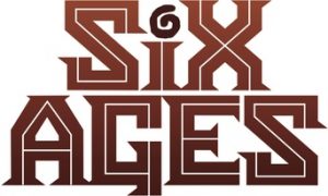
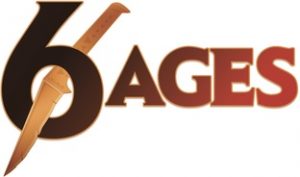
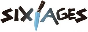
I ran the designs by the Six Ages team and Chaosium (licensor of the setting). There was no clear consensus, so I asked Pixel Parlor to iterate on the two favorites. Here’s a couple examples from round 2:
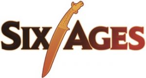
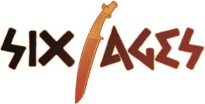
Again I asked what the team thought. Again there wasn’t a definite favorite. I zoomed out to see all the logos at the same time. When they were small, it seemed like the carved style font was the most recognizable at small sizes. Which would be important in say a Steam listing.
I didn’t really like the E that looked like a greek Σ, however. So I asked for another set of variations. Again there wasn’t a clear winner, but I finally picked the one that wasn’t likely to be confused for a game about ancient Greece.
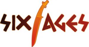
Hopefully this will prove distinctive and help suggest what the game is about (one of the artists noted that the lettering reminded him of the Gloranthan runes). At any rate, it’s nice seeing in the game.
Update: I just noticed that Pixel Parlor also wrote about this.
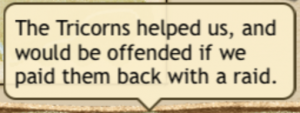 Advice about raiding-related promises currently shows up in the War screen, but if you go to the Raid screen, it doesn’t. As a player I’d be more likely to expect to see it in the Raid screen and would entirely miss it in the War screen.