Six Ages: Ride Like the Wind was an attempt to recreate the magic of King of Dragon Pass, both from a game play sense, and from the personal viewpoint of a creator making something special with a great team. King of Dragon Pass managed to keep some people playing for nearly two decades. Making it was for me an amazing collaboration.
The game is a peculiar combination of narrative and turn-based strategy, drawing on the rich background of Greg Stafford’s Glorantha. The story is driven by making narrative choices, and held together by a politico-economic model that provides context and meaning to those decisions. And your strategic decisions can result in new narratives.
The scope of the game is also unusual, in that you’re in charge of a small clan whose story unfolds over several generations. Individual characters advise you and execute your decisions, but they may die of old age before the game is over.
Here’s a postmortem of the development process.
What Went Right
Improving the Formula
Why tamper with what works? Over its long life, King of Dragon Pass has sold nearly 200K copies. So Six Ages is a similar game. But we tried to improve the weaker areas and double down on the strong points.
I’d already simplified KoDP a bit for its 2.0 reboot, but there were still fiddly bits like precisely allocating land use, worrying about exact labor allocation, and counting individual beans, er, Bushels of food. A new system of Ventures, or special tasks, lets you clear fields or pastures without worrying about the numbers. This mechanic handles a wide variety of economic chores, giving the player a lot of control over how to allocate the clan’s labor. And we now assume your clan knows how to feed itself, and you only worry about having a sufficient reserve to make it to the next harvest.
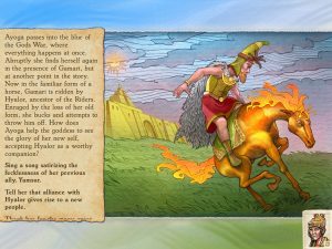 Heroquests—reenactments of myths on the Other Side—are a unique feature of the setting. They are intentionally unpredictable, to be true to Greg Stafford’s writings. This often frustrated KoDP players. In Six Ages we made several changes in the ritual visits to the Otherworld, in particular providing an in-game explanation of what went wrong (for example, “She said she should not have expected Yamsur to help. All the stories suggested he wouldn’t.”). We also do something similar for failure in more mundane situations (“<testee> said Nyalda might have heard our pleas if we’d devoted more ritual time to pasture magic at Sacred Time.”).
Your advisors have personalities, and we added new quirks (e.g. the Song Quoter and Xenophobe), and made sure that your clan council would sometimes talk to or about each other (since that was one of my favorite bits of KoDP). They may also initiate actions to further their own agendas.
Under the hood, we rationalized how success chances were calculated, and came up with a flexible system of concerns, which are essentially ongoing modifiers to a leader’s odds of success or the economic model. This made emergent properties easier for the designers to understand, and helped explain things to players.
Glorantha
Part of the formula was the mythic setting, Glorantha. We went all in on exploiting Glorantha’s rich background, setting the game in what KoDP regards as the age of mythology.
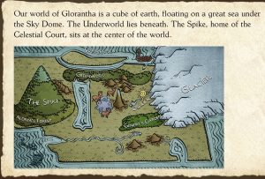 Even though the game was in a less documented time and place, we still had a lot of Gloranthan lore to draw from. We added new details as needed, expanding on material written since KoDP came out.
Greg Stafford, the creator of Glorantha, had retired and I didn’t really have the chance to work with him again. He did make some useful comments early in development. I was in close contact with Chaosium’s Creative Director, and we shared ideas and maps. You’ll find some of our art in Chaosium products.
Team
Once again I was able to work with extremely talented people. The Six Ages team was virtual, spread across many countries and time zones. I’ve never met most of them in person. But I didn’t need to limit my search for the best people to those I could meet with face-to-face, let alone share an office with. To stay in touch, I experimented with using Slack when we had a small group of concept artists. This turned out to work very well. (It certainly helps that so many people read and write English, even if it’s not their native language.) We didn’t end up with the same sort of cohesive team you can get when everyone is working in the same physical space but it still felt like a team. And once again, it felt to me like a great collaboration.
Being able to work with members of the original team also turned out to be a marketing point.
Testing Focus
To leverage a very small QA team, I made sure they were supported by tools. A debug dialog allows viewing raw values, running scripts, or setting up unusual situations. Many debug scripts do the same, and when QA wanted a new one, it was always top priority so they could keep going. For example, they might need to turn someone into a shaman, or make a neighboring chief a woman.
The scene compiler, which processes our custom scripting language, outputs a number of reports. They can be compared across builds, which made it easy to spot script typos. The compiler also output all text from the scripts. I’d periodically spell check this (which always made me come close to regretting that we’d included a personality quirk of inventing words).
Other typos could be caught by automated tests. I created unit tests which did crude sanity checking of every response of every scene. These could be tweaked to check certain problematic situations, like having no wealth or friends. I never got this fully automated, but the tests did keep a lot of bugs from even getting to QA.
Another tool was the ability to report issues directly from the game, on demand or after a crash. Reports include a detailed debug log which shows the scripts run, along with variable values. They also include two game saves (in case going back in time made it easier to reproduce a bug).
We didn’t add playtesters until relatively late. They had the same reporting feature, and I added a bunch of turn by turn economic data to reports, to help tune the game.
Refined User Experience
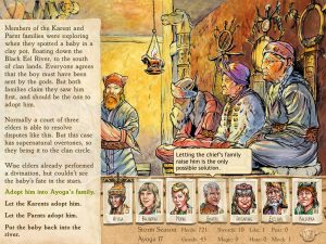
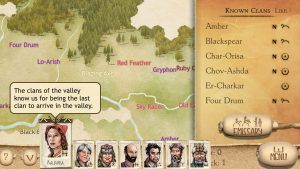 King of Dragon Pass came out when we didn’t have to worry about multiple screen sizes (both in its original 1999 release, and the 2011 iPhone edition). To handle phones as well as tablets and computers, we came up with a design that has two basic size classes. Each handles different screen sizes within the phone or tablet size class. (Tablets and computers have the same basic layout, though they’ll have other UI differences). This turned out to be very useful when Apple introduced an iPad with twice as much screen real estate as previous models. As much as possible, layouts within a screen are the same for both size classes. Small layout adjustments can be made by constants for finer-grained size categories.
Although your advisors mention exceptional circumstances, we also show them in a dashboard associated with the screen-switching menu. The economic concerns mentioned earlier are the most common, but promises, opportunities, and transient warnings also appear in the dashboard. This gives a quick summary, which advisors can give more information about.
KoDP’s tutorial was an attempt to show most parts of the game in one game year, but it tried to give the player as much freedom as possible and ended up very brittle. Rather than direct you through every management screen, tips now appear in context, so you can learn about a feature when you first encounter it. Playtesting revealed that this worked well if you were familiar with KoDP, but didn’t give you an overall sense of how to play. We added a very constrained tutorial at the last minute, which gives players an interactive introduction.
Like KoDP, Six Ages supports VoiceOver, so blind and low vision players can play on an even footing with sighted players. We redesigned how exploration worked to be task focused, rather than literally trying to duplicate the experience of choosing arbitrary spots on the map.
What Went Wrong
Schedule
I never made a very detailed estimate, but figured the game would take about 24 months. It ended up more like 46. By comparison, the original King of Dragon Pass took about 33.
Some of the slip was probably because I didn’t have any other programmers or producer (as I did with KoDP). And some of the freelancers couldn’t always work full time. But mostly it was a problem of not understanding the scope of the game. It was intended to be shorter than the long game in King of Dragon Pass.
The original plan was 275 interactive scenes. It ended up with 412. (KoDP had about 600.) Although we knew we could drop things like the tribal negotiation scenes in KoDP, we ended up needing even more scenes for the victory track than KoDP had.
We came in over budget as well, but only by about 23%. And that was still significantly less than the budget for KoDP.
The lengthy development period made it harder to generate buzz, since the release date was so far away.
We do hope that when we make the next game in the series, we won’t have to create all the infrastructure, and will have a better sense of what’s needed.
Cross-Platform
We’d hoped to be able to release the game on more platforms relatively quickly. Unfortunately, third-party libraries we’d hoped to be able to use were either discontinued by the time the game came out, or couldn’t be used with the latest development tools.
We’re currently working on a port, but it’s going to be much more expensive and time-consuming than we’d originally expected.
Team
The downside of working with freelancers is availability. Of course, an organization with employees can have turnover as well, but a couple team members left to further their careers, and several were constrained by other projects or caring for young children. In the end I don’t think this caused significant delays, but it was a constant worry.
UI
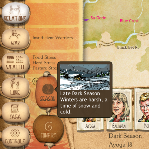 Even though the UI works well, one of our tradeoffs turned out to be problematic. Players often need to be aware of the current season. Although this was always shown on iPad, and easy to get to on iPhone, players weren’t always familiar with the Gloranthan seasons. In King of Dragon Pass, an illustration helped remind them. We eventually added a popup showing an illustration, but this wasn’t nearly as convenient. On the plus side, we managed to convey additional information (whether you were early or late in the season), and the dashboard probably was more important. Earlier playtesting might have caught this in time to rework the UI.
Another issue that surprised us: a few players complained that we’d made the text too small. It turned out that they had large devices, and because KoDP wasn’t designed to take advantage of them, iOS enlarged the screen. These players were unhappy with the extra screen real estate they got because Six Ages will show more text instead.
Story
It turns out that when winning the game depends on a plot twist, it’s really hard to tell players how to win the game. Many players aren’t sure what to do up to that point. And if they fail to win, they often have no clue why.
Not only that, but the overall game story is a bit of a surprise if you’ve played King of Dragon Pass.
These factors also made it harder to do buzz, since there was a lot I didn’t want to reveal too early. For example, we couldn’t do open development like many indie studios do, because in a story game, there isn’t much else to talk about other than the story. And much of the art could also be considered to spoil the story, or at least a big PR splash at launch.
Conclusion
Currently the game is out on the App Store, to very favorable player response (4.84 stars) and pretty solid sales for a “premium” game from a tiny studio. Most reviews say it’s a more polished game, with an equally strong story and mythology, compared to its predecessor. According to one player, “the initial similarities to king of dragon pass give way to a realisation that this is their new masterpiece. Nuance and depth abound- every corner has been refined and the love in the design is deeply evident.”
We’re still in the middle of porting, adding new features, and fixing pesky bugs. But we’re encouraged by this response and hope to start working on the second Six Ages game very soon.
Thanks very much for the retrospective, it provides valuable insight into the process of developing a unusual (?) game like Six Ages.
I was surprised to read that Six Ages was cheaper to make than KODP. Was that mostly due to not having a second programmer in the team? Or just a matter of needing less graphic materials to illustrate a smaller number of scenes?
Happy to hear that the game has worked well commercially on the Apple Store, I wish you the best with the port to PC.
Hi Mr. Dunham, great read on the making of the game.
I wanted to ask you if I could about other clans purchasing your food. They pay quite a bit for even just 4 weeks or so of foodstuffs (is 4 weeks half a season?). Is this working as intended, and is it because of the game’s lore?
I put the majority of my clan’s efforts into agricultural strength, so it makes sense I have so much of it. I was just surprised at how well that translated into an abundance of other things via trade.